Masonry


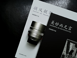
Slide Gallery
The slide gallery is a Bootstrap carousel component restyled that comes with default indicators and circle indicators, also you can set the size of arrows nav with .carousel-nav-sm and .carousel-nav-lg classes as below, if you leave it blank the arrows nav will display in a medium size.
You can set the arrows nav to dark color with .carousel-nav-dark class.


Carousel Gallery


Synced Gallery
There are data attributes that available for Synced Gallery as below.
data-gutter="" [Thumbnail slide columns gap]
data-dots="" [Show dots navigation, true/false]
data-thumb="" [Thumbnail slide columns on extra small devices]
data-thumb-sm="" [Thumbnail slide columns on small devices]
data-thumb-md="" [Thumbnail slide columns on medium devices]
data-thumb-lg="" [Thumbnail slide columns on large devices]
data-thumb-xl="" [Thumbnail slide columns on extra large devices]
The default value of data-thumb is 3 columns, assuming if you would like to set 3 columns for extra small and small devices, 4 columns for medium devices and 7 columns for large and extra large devices, your HTML markup will look like below.
....
You can set the size of arrows nav with .carousel-nav-sm and .carousel-nav-lg classes as below, if you leave it blank the arrows nav will display in a medium size.
....
You can set the arrows nav to dark color with .carousel-nav-dark class.
....


